Steam app overhaul
Goal
Identify people's problems from a popular app and create a low-fidelity prototype to test between students.
How might we
-
Overhaul the steam app, simplify and optimize its interface
-
Make users access the functions they want faster
-
Make the app look inviting and easy to understand, so that users are more likely to make a purchase
People problem
The Steam app on smartphones serves as an authenticator, an online game shop, a community access platform, and many other functions. There are many problems with this app.
-
The app is trying to include too many elements into one platform. It does not highlight its most essential functions; instead, it makes all the functions into a list, and users may have difficulty understanding what each word means on the list.
-
Many functions on this app rely on the web browser. For example, if the user wants to browse the steam store, the app will have to load the whole cell phone version of its website to access it, making the experience laggy and clunky.
-
Many interactions are missing on the steam app; for example, when the user tries to scroll a row of games, it does not continue to roll based on the user’s action. It does not tell the users which tag they are on the list of functions.
-
Too much information on one page.

Before: Featured

Before: Shopping

After: Featured

After: Shopping
This is the last UX project
Check ONO, my most recent project!
Prototype Video
Sketch
Low-fidelity prototype


Feedbacks
-
A larger gap between product imagines
-
Increase gap s between elements, heart icon should on top
-
Background blur upon oping floating menu
-
8 - 12 pixels breathing room
-
16-24 pixels between sections
-
Leave more room at the bottom because there is a strip there in the iOS system
-
Put scroll in [Library], so users know how deep is the library
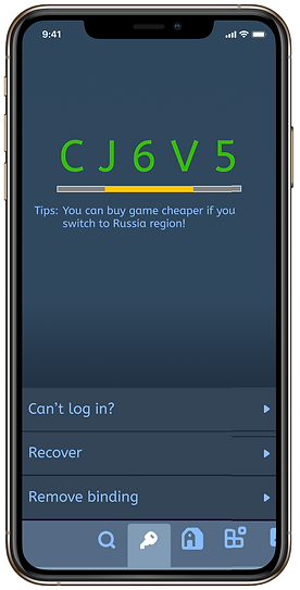
Final prototype


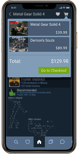


Link

This is the last UX project
Check ONO, my most recent project!